A next-gen rich text editor forAI
Out-of-the-box, Markdown-friendly
Full framework support (React, Vue, Angular, Svelte...)
Why choose AiEditor
Simple to integrate, Easy to use, Open source license friendly,
No limit count of users and apps, Rich documentation.
Out of the box
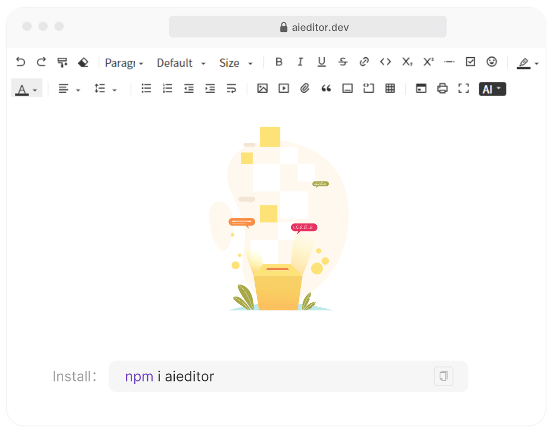
AIEditor works out of the box. Users can quickly integrate aieditor in their projects with the npm install aieditor command.
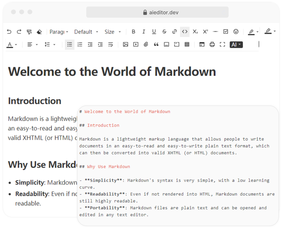
Markdown Friendly
AIEditor is Markdown format friendly, able to recognize and correctly render Markdown's basic syntax, real-time preview function, WYSIWYG.
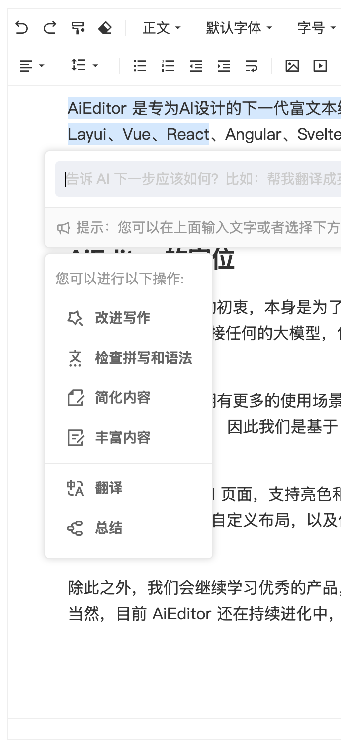
Powerful AI capabilities
Such as AI translation, AI continuations, AI optimization, AI code blocks, AI conversations, and more, the ability to customize AI menus and Prompt words, Supporting almost all LLMs on the market.
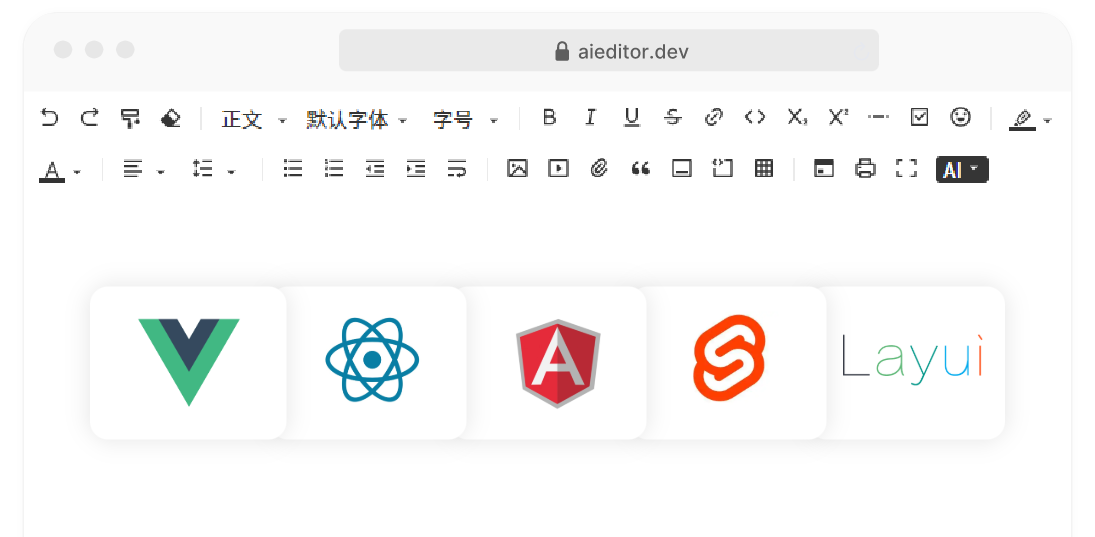
Full frame support
AIEditor is developed based on Web Component and supports any framework,such as React、Vue、Angular、Svelte、Preact、JQuery and more.
AIEditor nice features
Awards
Winning is just the beginning, not the end.
We will continue to work hard to empower AI and contribute to society.
No.1 in AI Application Competition
A total of nearly 300 teams submitted creative proposals,AIEditor won the first place in the competition.

No.1 in Producthunt of the day
We got 650 votes on the producthunt, which allowed many new users to discover our team and start integrating with aieditor

GVP in the Gitee
GVP stands for Most Valuable Open Source Project,it is a Gitee ranking of outstanding open source Project showcase.

Are you ready?
Next, whether you use the open source version or the commercial Pro version, you will be surprised!